Sunday, June 26, 2011

Walk (and Stop) like an Ampelmännchen

One of the most eye- catching elements while walking on the streets of Berlin is the lively, cheerful ‘Ampelmännchen’ (little traffic light man)

Ampelmännchen is a symbolic person shown on traffic lights at pedestrian crossings designed in former East Germany and is still used in Berlin. The Ampelmännchen was designed to solve these problems:
- To help pedestrians easily distinguish between the traffic signal for vehicles vs people (mainly children) and bikes
- To help color blind pedestrians

The idea behind Ampelmännchen, traffic psychologist Karl Peglau also criticised the fact that the standard colours of the traffic lights (red, yellow, green) were not understood by colour blind road users (10 percent of the total population); and that the lights themselves were too small and too weak when competing against luminous advertising and sunlight. Peglau proposed to retain the three colours but to introduce intuitive shapes for each coloured light.

Unlike motor traffic, pedestrian traffic has no constraints for age or health (physical or mental), and therefore must allow for children, elderly people and the handicapped. Peglau therefore resorted to the realistic-concrete scheme of a little man that is comprehensible for everyone and appeals to archetypical shapes. The thick outstretched arms of the frontal-standing red man is associated with the function of a blocking barricade to signal "stop", while the side-facing green man with his wide-paced legs is associated with a dynamic arrow, signalling the permission to "go ahead". The yellow light was abandoned because of generally unhurried pedestrian traffic.

Peglau's secretary Anneliese Wegner drew the Ampelmännchen as per his suggestions. The man's "perky", "cheerful" and potentially "petit bourgeois" hat was added as an element of surprise. And it is different from the boring Ampelmännchen which is used in other parts of Germany. There are also other versions like the Ampelfrau, which features a girl.


While designing icons for interfaces we also need to keep in consideration the practicality and the element of surprise which the Ampelmännchen uses.

Image source:
kiat.ongs.info, wikipedia.org

Tuesday, November 2, 2010

Using Anti-Patterns in Your Design

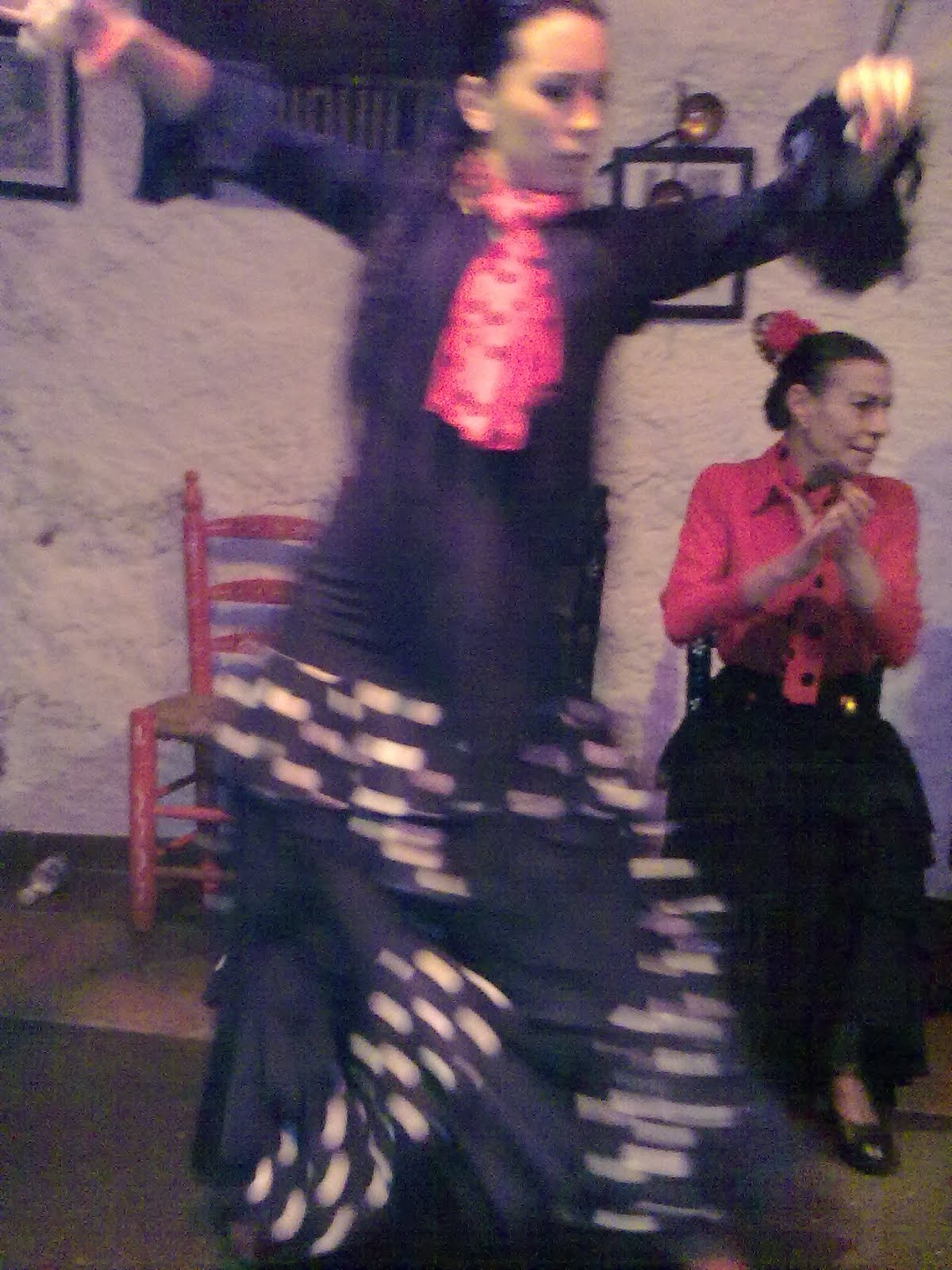
It is amazing to watch Flamenco dancers use patterns and anti-patterns while performing in the caves in Granada. This popular dance of Andalusia region in Spain is mainly based on footwork and storytelling (just like the Indian classical dance, Kathak).

Flamenco is also accompanied by handclapping and guitar. The rhythmic beats usually follows this pattern, the bold font being the strong beat (louder hand clap or stamping feet) -


1    2    3    4   5   6    7    8    9    10    11    12

However, they also follow the off-beat to change the regular pattern to make it livelier. The off-beat could be stressing on the weak beats instead of the regularly accented beat. There are also stops in tapping and sudden increase in the speed of the beats which follows the music.

This pattern of Anti-pattern is very useful in design, if used in limited situations. It is mainly useful for these reasons:

To Create Delight: This is needed to break the monotony in the design. Usually, there are a lot of guidelines for displaying logos and logos are one element which cannot be changed frequently. But Dopplr's logo (Dopplr.com) changes colors based on user’s travel. Also, in Dopplr, the consumers own the brand and not the company. By itself the logo is has 6 color filled squares lined up horizontally. But, the logo colors changes for each member of dopplr, depending on their travels.

Dopplr’s logo becomes user’s logo, reflecting what user is doing and is different for each user. Very similar to Flamenco's vocal music which does not follow a set pattern but ensures it falls in the overall framework.
This anti-pattern is not just delightful but also informative.

Better Marketing: The iPhone does not have any logo in front of the phone unlike it's competitors. This does help in marketing the product for people in the front , similar to how the person sitting opposite to the MacBook Pro sees the glowing logo.

Security:
Certain applications prefer to be complex for security reasons. The pattern of displaying the exact location of error, why it occurred and how it can be rectified is often the rule. But on login screens, usually the error messages do not specify whether the error was on login field or password field, to avoid providing a hint to hackers.

Monday, October 18, 2010

Is Crowdsourcing firing Designers?

Recently when customers rejected the new redesigned GAP logo, GAP decided to crowdsource the redesign exercise to help define their brand.
The entire GAP redesign exercise emphasized that if designers do not do their job well and management do not make wise decisions, the customers reject it (after all the customer is the king). And they will also suggest a redesign of the brand for you!


There may be many reasons why the design exercise could have gone wrong - like management making all the design decisions or underestimating design or their customers (thinking they would blindly accept their chosen logo). The management have realized that their decisions are not final, even when it comes to logo redesign. And the outpouring on the social media on this topic suggests customers do care for products they have been buying over the years.

As the blame is now on the design firm who came up with this logo and GAP having decided to crowdsource instead, how do the rest of us (designers) ensure we do not fall into such situations? And how do we ensure crowdsourcing does not fire us and instead we work hand in hand. Moreover, what will our role be henceforth?

If you look back, from the time digital media entered the lives of designers (in 90's), designers needed to had these basic skills:
  • Idea generator, Creative, at times think out of the box
  • Understands problems, users and provides appropriate solutions
  • Produce aesthetically pleasing designs – have good knowledge in color theory, typography, layout, etc.
  • Apply usability/ ergonomic principles
  • Be proficient in all design softwares (esp. Adobe products)
  • Work with team

With the explosion of the internet since late 90s, where anyone can access basic tutorials on Graphic design and opensource tools like GIMP, consumers are now taking a shot in designing, just like photography. And companies are trying to capitalize on this through ‘crowdsourcing’, just like what GAP is doing now, as it turns out much cheaper than hiring a design firm! Added to this, the design is created directly by the end user and their needs are being stated through design.

An amateur designer can have all the points mentioned earlier to a certain extent. S/he may be creative, have ideas, execute solutions in an amateur manner using the design tools. There will be more tools in future which will auto-suggest color combination, layout (just like what templates have already begin to do now)

However, crowdsourcing will also generate enormous individualistic data and management will still need to pick the right design which will reflect everyone's perception of the brand or idea. This is where we designers can capitalize.

Our roles in future will mainly be to –

Engage Users
We will need to draw ideas from everyone, while allowing everyone to express themselves, which in turn makes customers feel they are being engaged in the entire exercise. We collect their inputs (data) for our design process and to further validate our design to the client with the populist data. We can also revalidate our design again through crowdsourcing and when the design is finally out in the market, the users will be proud of the outcome!

Analyze and draw insights
We will need to use crowdsourcing for design research to get insights to our design. The data collected from users through crowdsourcing (eg: pictures of their daily routine, etc.) will ultimately help create better products.

Induce design thinking
A designer will need to induce design thinking in the organization or team, and drive the design exercise, with team members, stakeholders and customers, getting their hands dirty in design implementation. A designer’s role will be to facilitate and bring out the best ideas from everyone and manage the entire design exercise! And use ‘Crowdsourcing’ as one of the methods from user research to design implementation.

And how do we designers achieve this - We will however need to focus more on design strategy and behavioral aspects. The technical aspects like layout, typography, usability heuristics will be automated in future. We will need to think cross-disciplinary rather than specialize in individual fields like graphic, fashion or industrial design in future.

The client/ management will also need to understand the importance of design, branding and be more involved in the design exercise while giving powers to the designer to make strategic decisions.

Thanks to Vinay and Anshuman for their inputs on the role of a designer in future.

Thursday, September 30, 2010

Catch my Mood

Successful advertising always captures the mood of the users. With many devices, like mobile phones, even vending machines, trying to become 'mood sensitive', we designers can capitalize the data of the user's 'mood' for advertising.

As advertising on devices increasing becomes content and location based, along with 'augmented reality' becoming a reality , adding the 'mood' can lead to the next level of advertising.
Imagine my phone detects I am 'sad' or 'happy' or 'confused' based on my speech pattern, body temperature or heart beat and display ads which are mood sensitive for the already captured location and content.

Below is an example scenario:

Deepti is research student, who spends her evenings working by the river shore


She receives a phone call saying her research work on Pre-Columbian art in Peru will be funded.


The phone immediately detects she is excited and happy, and displays messages asking her to celebrate. It shows options where she can celebrate based on her location.


While advertising based on user's mood, we should also ensure it is very subtle and not intrusive.

Mood sensitive interfaces can have other uses apart from advertising. It can be used for medical purposes or for children with special needs.

Thursday, September 16, 2010

Cooking the Engaging Experience Iteratively

Iterative design is like preparing the popular sweet of West and South India – Puran Poli (in Marathi) or Holige’ / Obbattu (in Kannada).

Traditionally, the entire process of making Puran Poli was very social, where women gathered around and would discuss their problems or share their joys while preparing the dish.


In the design process, we can start with brainstorming sessions and interactive workshops which ‘engage’ the stakeholders, team members and end users to make the product create the ‘engaging experience’. We can also collectively derive at ‘Scenarios’ to capture the ‘social’ aspect of the product being designed.

A scenario talks about the user, situation and user’s goal. Let’s assume we are designing a mixer grinder (blender), one of our scenario can be ‘Mrs. Joshi and her friends want to make a traditional sweet dish for Ganesh Chathurthi. She needs the blender to help her prepare the sweet while talking to her friends’. Mrs. Joshi will then need a mixer which does not disturb the conversation with her friends. If so, then it needs to make very little noise so that it does not drive her friends away from the blender or disrupts the ‘engaging experience’

Engaging experience can be built iteratively by thinking on 'what features to have', 'how to implement' and 'when to implement'. Iterative design involves building the core essence of the product first and later building over and around the core essence in several sprints. Just like the puran poli where the ‘core’ is jaggery and channa dal, which gives the dish its taste.

The process of preparing the ‘core’ (Hoorna or Puran) begins with the right mixture of jaggery, channa dal and cardamom. This mixture can be eaten as is and is the bare minimum to be considered a sweet by itself. This is similar to KANO’s model of ‘Must haves’ in a product. So in the above scenario, the ‘Must haves’ of the blender is built around the features supporting the ‘quiet performance’.

Once the goals and scenarios to achieve the goals have been established, the next process is to divide these into iterations, on how to achieve the must-haves (core), the extended features and the delighters.

While making Puran poli, the next stage will be to use the core (Puran or Hoorna) as a filling. This is similar to the extended features the product will have around to enhance the ‘core’ or goal.

Here, we can re-validate our features which go around the product. Can it still be packaged as puran poli or if suddenly realize there are no right ingredients, can it be packaged as something else like Kadabhu (Karjai). Either ways, the core (jaggery+ channa dal) still remains the same.

In iterative design process the requirements may change over course of time, however the ‘goal’ of the user still remains the same. Eg: The blender instead of just being table top can now be combined with a micro-wave oven, so that it cooks while blending. Or, an application to help users get live traffic update can change from being a web application to a mobile application to better help users while driving. In both examples, the goal – ‘to provide quiet performance’ or ‘to get live traffic update’ remains the same as the ‘core’ filling of Puran poli or Kadabu.


Once the decision has been made, the next level of preparation begins. The Puran poli is fried and the product is ready to be packaged.


Finally, packaging the product is similar to serving Puran poli with ghee on top or serving it with milk on a banana leaf. The aroma creates the aspect of ‘delight’. Just like how products need to have ‘delighters’ or pleasant surprises which helps go beyond the basic necessities.


The core of the Puran poli can also be extended to other dishes. Usually the left-over hoorna is used for making a special rasam - Kattina saaru (in Kannada) or Kaatachi Aamti (in Marathi). The experience is extended as it is had after eating the sweet dish. Or, even if someone does not have the puran poli itself. This is similar to extending a product’s brand to other mediums. Eg: creating a section on Facebook or Twitter to market the product.

Throughout the entire process of preparing Puran Poli - from planning, cooking, to serving, and even eating it, is very interactive and social. These are the qualities we designers need to incorporate to make our design process more ‘engaging’ apart from providing an engaging experience to the end users. We need to ensure we engage our stakeholders and team members in all stages of our design process to decide on ‘what the product will have’ and ‘how to implement the product’.

Few methods a designer can use - User stories are helpful to begin and also draw boundary for conversation between team members. Creating story maps based on scenarios along with other team members can help decide how to iteratively develop the product. Interactive quick sketches by inviting other team members to sketch (if they wish) their ideas on top of our sketches or critique your sketches also leads the team to engage in your design and encourages to be expressive as well.


Thanks to Swapna for sharing these awesome pictures on preparing the Puran poli. Recipes to make other delicious dishes can be found on her blog - http://swadofindia.blogspot.com/

Tuesday, September 14, 2010

This newspaper, err... advertisement talks...

Few days ago, I woke up to a talking ad by a major car company featured in newspaper. The newspaper had a small device pasted on the last page which began to talk after opening the paper. This was a cool concept, however sent a scare among readers as well. Many readers in Bangalore thought there were some insects in the paper making noises and few called the cops mistaking it to be a bomb!

This device was very similar to the auto- launched audio/video ads one sees on websites. As soon as you open the website, they begin to play the video/audio. And you need to pause to make them stop. The newspaper needed to be closed to stop the audio.


The audio ads (both in newspapers and web) can be very annoying for these reasons:

They are not context sensitive – This often leads to embarrassing situations. When I wanted to catch up with the daily news while in a long meeting, a lingerie ad began to play, raising eyebrows of the other colleagues! The audio/video ads do not know which situation the user is currently in. Whether s/he is a meeting or at home. Or is s/he alone or with friends. Audio ads can work if they find the context and play appropriate ones while respecting ones privacy.

Difficult to make them ‘shut-up’ – In both cases, user has to check how to turn the annoying ad off. In newspapers, which page it is in and how to turn it off. In websites, which tab (out of all the tabs open) is the ad from?

Unrelated sounds – User gets a car ad when surfing news on Afghanistan

Inaudible Having a low-quality, amateur recording

Hopefully, we designers will take care of these problems while designing the ads the next time.

Thursday, August 12, 2010

Applying Principles of Salsa Dancing into UX Design

Salsa, a popular Latin American dance, and UX design have a lot of elements in common. And designers can apply some of these principles into their process.
The most important aspect in salsa (or even ballroom dance) is getting the connection right between the dancers. Similarly, for a design to succeed, the designer has to connect with the end user- understand their mental models, predict how the user would navigate, consider the user’s likes and dislikes , and design appropriately. The designer cannot design a product just because s/he finds it cool or creative.

Good dance has well synchronized sequences. This is similar to the sequence of tasks a user does. Designers usually define scenarios to define how the product will be used. The smoother the sequence is, the better the end user experience.

Movements are building blocks to any dance, which define a sequence. Similarly, every interaction in a design defines how well the task can be completed.

Patterns of foot work, swivels and turns help be a better lead and a receptive follower. The designer also needs to understand patterns in usage of elements, problems faced by users and design in a way which would be well-received by user. Patterns in rhythm and beats set the overall mood on the dance floor. Similarly, the designer needs to consider current trends or ‘mood’ to create the appropriate designs.

Space and path (floor path) are important factors which defines how the dancers will traverse and the direction (such as forward, backward, sideways). Similarly, in a design users would traverse across the interface, and the designers need to make sure that the users traverse as smootly and elegantly as possible and complete their tasks easily. On the visual front, the designer needs to take care of both positive and negative spaces for the interface to work well.

Time (or tempo) in dance defines the speed of the dancer. Dance, music (unlike other forms of art like painting) incorporates linear time pattern, which means it moves through time and space. This is an important factor for designers too. Can the user complete a task in a short time? How long do I display a notification when the user receives a mail? And, how quickly should it fade away?

In Salsa, whether dancing with a partner or in a group (as in 'reuda'), there’s always a lead. The lead always aims to provide concise lead with accuracy. The other/s follow the lead; yet they have their own style and movements. If the lead is difficult to follow, the partner stops partnering him. Hence, the lead must adapt to the partner’s skills (based on whether the partner is a novice or an intermediate dancer or an expert), the available space on the dance floor and change the lead appropriately. The designer is like this lead who leads users to perform a certain desired task by understanding the user’s strengths.

Finally, one would always love to dance again with the same person if they had a good experience dancing with him/her. Just like how we designers need to ensure we have repeat users for our products!

So ensure a good ‘dance’ for your users!

Thanks to Afshan and Sannidhya for putting on their editorial hats and reviewing the draft.
image source: flickr.com/photos/axio/3388467035/

Friday, July 30, 2010

Is splash screen obsolete? How will it splash in future?

When we start an application, we are greeted by a splash screen. The splash screen lets us know the software we are about to open – it’s name, version, copyright information, the people involved in developing the software, loading status, etc.
The splash screens have undergone tremendous changes in terms of graphic design. A classic example is Photoshop, a tool we designers use often. Below are some examples of how it has changed over the years.


The earliest splash screen - single color, single font.


As the resolution of screens increased, so did their graphics. The splash screens introduced color and visualized the product’s features.


After few years, the rectangular splash screen changed to free-form shape, going beyond the rectangle box.

However, the information displayed in splash screens over the years has undergone very minimal change. The splash screens were ideal when computers were slow and took time to start an application. But with faster computers, which take less than 5 seconds to start an application, how will user be able to view this information in future? Or do users ever read this information everytime?
Few softwares introduced the startup (welcome) screen, which helped user to pick the task he wanted to do easily, immediately after the splash screen disappeared (as shown below).


In this scenario, do we need splash screens at all? Can splash screens do more than just displaying copyright, license information, loading progress?

With applications increasingly becoming suggestive, it’s more appropriate to merge splash screens with the startup screens. Merging them can help user to decide the task s/he wants to perform in few seconds as well as display the information about the software. While the application is loading in the background, user can decide and click on the selected option (eg: decide to open a new template) and begin their tasks right away after the application has loaded.

The splash screen can also me made social wherein it can have the following:

  • RSS feeds
  • Link to social networking tools like facebook on what others are talking about the software or if they discovered a new technique, or tips/ techniques
  • Ratings on the software feature
  • Appropriate links for collaborative work, where two persons can edit the file at the same time
Ideally, the splash screen can have the information as shown below:


Reference:
Images of Photoshop splash screens: http://www.guidebookgallery.org/splashes/photoshop

Thanks to:
Danny, Vinay, Afshan & Anshuman for reviewing my draft and providing relevant suggestions

Monday, April 5, 2010

But iPad doesn't fit in my tiny purse...

The past few days when most of my friends have been crazy about buying iPad, I must admit that iPad has not really impressed me. Here are the few practical reasons why:
  • It is 1.5 pounds, pretty heavy
  • The size of the iPad makes it even more difficult to carry around
  • Does not support flash and can support only one window at a time

But, would have considered buying iPad if it was foldable and could fit it my purse. Maybe, the next version of iPad could be just that.

Wednesday, March 31, 2010

Did I book it? or not?

On my recent trip to Stockholm, I had the daunting task to do my own laundry. This led me to interact with a complex laundry room booking system. The booking machine had all the instructions in Svenska and the interface complex even for a localite (A Swedish lady who tried to help me was also confused!)


Finally, when I did manage to book a machine, it took few minutes to figure out which washer/dryer I had booked, as the label on the machines were equally confusing.


The whole experience made me realize the importance of pictorial interfaces. Pictorial interfaces, with appropriate use of iconography, can cover various user demographics. Pictorial interfaces cross the language barrier and
illiterate users will be able to understand them as well. Pictorial interfaces do have few drawbacks regarding accessibility (how will a visually impaired user use these systems?), but however makes things simpler.

Tuesday, May 26, 2009

The Inside Story

Off late, there is a lot of interest on photographs, posters of products being disassembled and providing details of all the parts inside.

There is also another recent trend called 'Exploded View'. Although this trend was originally used for Lego instructions on how to assemble the different lego blocks to build models, recently designers have been using them to display hidden technologies and to boast the hidden value of the product side. For example, the recent advertisement for Hermès watches that reveals all the gears, escapements and jewels to convey the product’s importance and the preciousness of its complexity.

In today’s world, the news is often punctuated by explosions, and increasingly there is a sense of the center losing grip and of things flying apart. The exploded diagram might make real life seem menacing. But dissection is also teaching, and showing the parts is a fundamental element of learning and study. You can read more about this by Phil Patton at the AIGA website

I tried to create an exploded view of my name below :-) For ones who are not familiar with 'Veena', it is a stringed musical instrument and an integral part of Indian Classical music. The different parts of the veena reveal some of my skillsets.


(click to enlarge)

Thursday, April 30, 2009

Voting experience in Indian e-lections

The 2009 Indian elections can be divided into 2 phases - ‘Deciding’ phase and later the ‘Voting’ phase. Deciding phase is when voters evaluate candidates and decides on a candidate to vote for. The Voting phase involves the process of voting - getting their voter’s ID, information on the right polling station and finally casting their vote.


This year’s elections saw a significant change in the polling experience in both the phases for voters. It was the first digital election in India and had many technological advancements.


The 2008 US elections had a significant influence on the Indian political parties. Inspired by Obama’s campaign, all the major Indian parties quickly utilized the power of social networking tools like facebook, YouTube, Twitter apart from having websites for their parties and candidates. They also utilized Television and mobile phones for campaigning. Television was a big way to get the message to illiterate voters in remote areas. These mediums also supported voters to discuss and voice their opinions, concerns in a transparent environment.


Apart from the political parties, corporates also pitched in to help voters decide. Google, along with Hindustan Times, developed a site which helped users to locate their constituencies and polling booths, the candidates from their constituencies, their background (education, criminal record, etc.) and their quotes. This site helped voters be better informed of the issues by making available comparative area-specific development data such as crime rate, literacy rate, and poverty, among other indicators


Tata’s Jaago-re site helped voters register and get their voter’s ID quickly. This was an improvement from the previous years where voters had to wait for hours in endless queues to first register and then get their photos taken. Users also had the flexibility to register anytime on the website, and were provided the details where they needed to get their voter’s ID.


Voters were categorized by Part number (polling booth) and Serial Number (individual). Voters could find the exact polling room through this information


Finally, the electronic voting machine was very easy to use. The design was simple with the candidate's name, party symbol and an arrow pointing to it and a button next to it in a row. The one touch interface fared better than stamping on the paper, folding it and putting it in the ballot box as previous years. Immediately, the EVM was locked until the polling officer unlocked it for the next voter.


The EVMs assured voters that their votes were counted with better accuracy than manually counting the papers, which was more prone to human errors.


Overall, the digital process was simpler compared to the previous election. One can also say that this was a environment-friendly election with less use of paper. Hopefully, the EVMs can be reused or recycled.


The next election can further simplify the voting process and enhance the voting experience:

  • Provide a biometric voter’s ID, which can be scanned and quickly registers the voter at the polling station. This will also prevent misuse as it can read the fingerprint. It can also quickly bring the help information if a voter went to the wrong polling station. This can be similar to the passports and visas issued by few countries.
  • Computerize the process of finding the voter’s polling booths at the venue. A lot of people were unable to find their names and did not know where to go as the polling stations did not have computers to quickly find out (esp the place I voted)
  • Provide facilities for voters who are traveling or living in a different city or abroad to vote online
  • Allow rural voters (with no access to internet) to send questions, concerns to party candidates via SMS
These steps can ensure that there will be a better voter turn out the next time!

Monday, February 16, 2009

Is it On? or Off?

I often get confused while turning on and off the LPG Cylinder regulator knob. Especially, since I do not cook regularly.
The LPG cylinder if not handled probably, would create a disaster. However, the knobs do not clearly indicate whether it is on or off. There are few instructions, but are located on the top of the cylinder. If the cylinder is placed below the kitchen counter, one cannot see them from the side.
As you see in the image, the instructions are too small small for something very dangerous.
It is time the LPG cylinders provide clear instructions on how it should be turned off/on. This will avoid the many disasters which happen in India every year.

Saturday, December 13, 2008

Lost in Translation?

My interest in typography often makes me observe signboards. Especially, how the company names are translated in local languages on neon signboards.
Bangalore requires that the sign boards be displayed in kannada along with English.
While the sign boards in English are well thought and designed, when they are translated to Kannada or Hindi they forget to carry forward the visual, specifically the type treatment of the original logo. Very few signboards redesign the structure, form, proportion and font metrics of the local script to match the original.


Eg: the below logo in Kannada just italicizes a common font in that language. It also misses the green leaf which is part of the logo. Ultimately, it is unable to visually translate the brand into the local language


This logo forgets to carry the font weight of the original logo

Many times, the translated logo, either in Kannada or Hindi seem to exist only to please the law enforcing authorities. So they are predominantly smaller in size and placed in a corner.


There are few logos which translate their visual identity very well. Below is one of my favorite.

Some may argue since the main logo is in Kananda, a lot of thought might have been put to carry the type characteristics to English.

Another logo which tries to translate(the English neon signboard is also on green background) -


However, most of the companies can also invest in finding or even creating new type in local languages which match the type of the original logo. It ultimately helps carry the brand to the local consumers.

But why does translating the type treatment matter? Simply because logos are a visual depiction of the brand. And the brand carries the company's vision and all that it stands for. Hence, it is imperative to have similar type treatments across various scripts.

p.s. The above comments are only limited to typography and have nothing against the company or brand

Wednesday, December 3, 2008

Spell Check Disaster: 'Anshuman' becomes 'Inhuman'...

Recently, when one of my friend mistakingly applied spell check on a widely used mail, the person to whom it was addressed to - 'Anshuman' , was changed to 'Inhuman'.

This incident shows how features in applications which are supposed to make our job easier can actually create havoc (just imagine if Anshuman were his boss...oops!) Also shows the lack of geographic and cultural adaptability of popular applications. Asians, especially Indians form a significant proportion of users of these applications globally. However, only few Indian names are recognized.

Here are few recommendations on how this can be improved-

  • Design applications which can provide geographically and culturally appropriate spell check based on the selected country

  • Have a database of certain disaster words which double checks when used. Eg: provide message which suggests 'Are you sure you want to change it to 'Inhuman'? This may be irritating, but can definitely save all those embarrassing moments.

Monday, November 3, 2008

Bridging Business Strategy and Design

Intersting presentation on how to bridge differences between business strategy and design.

Friday, October 31, 2008

Tips to Interface Design

A good presentation by Garrett Dimon on designing interfaces

Wednesday, May 14, 2008

Can card sorting be used to define visual design?

Card sorting has been one of the key techniques to define the informational hierarchy of an application. As Jacon Nielson mentions "Card sorting is a generative method: we don't yet have a design, and our goal is to find out how people think about certain issues. There is great variability in different people's mental models and in the vocabulary they use to describe the same concepts. We must collect data from a fair number of users before we can achieve a stable picture of the users' preferred structure and determine how to accommodate differences among users."

Can this be extended to defining the visual design? We do not have the style specifications yet and different users relate or interpret various visual elements differently. Interpretation of color, form, fonts, layout are based on the individual's past experiences, cultural, socio-economic background and various other such factors.
Card sorting can be used to define visual hierarchy and the style of the application. It can be done with end users or within the design team or involving various teams, clients or all of them.


Keep reading this blog to get to know how to conduct a card sort for visual design

Saturday, May 3, 2008

Personalize or Customize?

There are two major trends in displaying information in the interface to users.
Personalized Interface and Customized Interface. Below is the description of differences from the slides of Vinay Mohanty and Devesh Jagatram on slideshare

Customization allows users to explicitly specify what you want. It gives user control at a generic feature level , where users see/hide etc what they want Eg: My Yahoo - user chooses which information elements might be presented on a home page, choosing display colors, etc.

Personalization uses implicit interests and learns what you like from your actions (you are what you click on and what you buy ) E.g. getting the information related to one’s preferences and regular activities Personalization is at the data/ content served level Amazon.com is an example of personalization where the latter learns your interests and adapts to your needs. Personalization also are called 'Adaptive Interfaces'

This brings the question where do I which one?
Customize interfaces toBold
    • Prioritize content
    • User controlled content
    • Customized Look & Feel for each user
    • Promote regular usage
Customizable interfaces work for interfaces like My Yahoo! Here user can customize features like colors / layout , placement of features on screen, etc.

Personalize when you need to
    • Promote sales of various products
    • Build a relationship that encourages the customer to return
    • Provide customized experience for online shopping to make it as real as in-person shopping
    • Target each individual customer differently by providing one-to-one marketing
    • Predict customer needs and purchase patterns
    • Identify customer characteristics by initiating 2 way communication
    • Make the interaction efficient and satisfying for both parties
A good example is Amazon.com. Personalization features in Amazon record customer preferences by asking her to rate/tag products ( 2 way communication), displaying recommendations based on user's shopping history or wish list.

Personalization doesn't waste time as it shows users what everyone else sees and then asking you to search or display / hide things. Make the interaction efficient and satisfying for both parties.

Personalization is increasingly becoming popular as it offers a way to focus on customers / users. Tools like collaborative filtering, rating, click stream analysis, cookies help personalization.

Few examples where it can be used - e-Retailer promotion, Financial portal content recommendation, Help desk or on-line technical support content, Gift recommendations for e-Retailer, Music, movie, book , or other product rating and recommendations, Travel - trip planners

Before defining the interface, decide which one you want to choose. Define what you want the interface to accomplish and select accordingly.

Few materials online -
http://www.slideshare.net/write2vin/user-experience-issues-personalization-vs-customization-presentation
http://www.slideshare.net/stephenpa/the-conversation-gets-interesting-creating-the-adaptive-interface