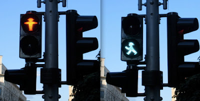
 One of the most eye- catching elements while walking on the streets of Berlin is the lively, cheerful ‘Ampelmännchen’ (little traffic light man)
Ampelmännchen is a symbolic person shown on traffic lights at pedestrian crossings designed in former East Germany and is still used in Berlin. The Ampelmännchen was designed to solve these problems:
- To help pedestrians easily distinguish between the traffic signal for vehicles vs people (mainly children) and bikes
- To help color blind pedestrians
The idea behind Ampelmännchen, traffic psychologist Karl Peglau also criticised the fact that the standard colours of the traffic lights (red, yellow, green) were not understood by colour blind road users (10 percent of the total population); and that the lights themselves were too small and too weak when competing against luminous advertising and sunlight. Peglau proposed to retain the three colours but to introduce intuitive shapes for each coloured light.
Unlike motor traffic, pedestrian traffic has no constraints for age or health (physical or mental), and therefore must allow for children, elderly people and the handicapped. Peglau therefore resorted to the realistic-concrete scheme of a little man that is comprehensible for everyone and appeals to archetypical shapes. The thick outstretched arms of the frontal-standing red man is associated with the function of a blocking barricade to signal "stop", while the side-facing green man with his wide-paced legs is associated with a dynamic arrow, signalling the permission to "go ahead". The yellow light was abandoned because of generally unhurried pedestrian traffic.
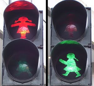
 Peglau's secretary Anneliese Wegner drew the Ampelmännchen as per his suggestions. The man's "perky", "cheerful" and potentially "petit bourgeois" hat was added as an element of surprise. And it is different from the boring Ampelmännchen which is used in other parts of Germany. There are also other versions like the Ampelfrau, which features a girl.
While designing icons for interfaces we also need to keep in consideration the practicality and the element of surprise which the Ampelmännchen uses.
Image source: kiat.ongs.info, wikipedia.org

No comments:
Post a Comment